Media kit
Logos, colours and fonts for articles and reports about TOKERO. Use the files as they are.
How to write our name
TOKERO is written in capital letters, as one word, in every language.
TOKERO in one paragraph
La crypto a donné à tout le monde accès aux mêmes marchés, mais elle n’a jamais résolu la question de savoir à qui faire confiance. TOKERO a démarré en 2018 comme un exchange fondé sur le respect scrupuleux des règles. La même conviction anime aujourd’hui notre réseau social : une identité vérifiable, une réputation qui t’appartient et une communauté où les personnes avec qui tu échanges sont celles à qui tu parles. Tout ce que nous lançons doit rendre la confiance plus facile à construire et plus difficile à falsifier.
The butterfly
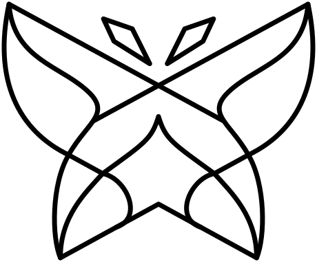
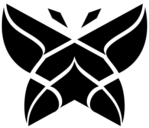
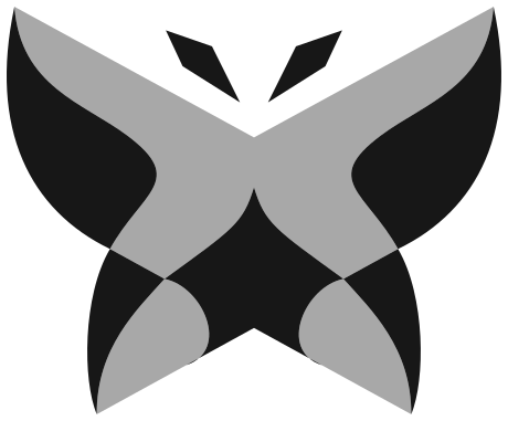
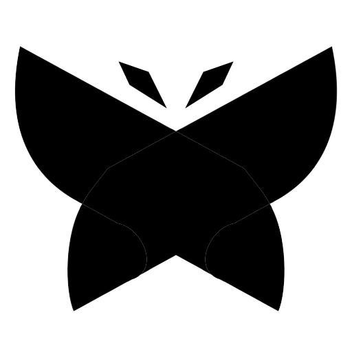
The butterfly is our mark. Every version comes in colour, black and white: colour for light backgrounds, black for one-colour print, white for dark backgrounds and photos.
The TOKERO wordmark
Use the day version on light backgrounds and the night version on dark ones.
Colours
TOKERO Purple is our main colour. The butterfly has its own palette, from periwinkle to deep violet.
Brand colours
Butterfly colours
Fonts
Montserrat is our typeface, for headlines and text alike, in weights 400 to 700. Alegreya Sans sets the headings of some pages. Both fonts are free on Google Fonts.
Using the logos
- Use the files as they are: do not redraw, recolour, stretch or rotate them, and do not add effects.
- Leave empty space around the logo, at least a quarter of its height on every side.
- On dark backgrounds and on photos, use the white or the night version.
- Below 48 pixels, use the simplified butterfly.
- Do not combine our logo with another brand's logo into a new mark.
Images
Photos of the team are on the team page. For other images or a higher resolution, contact us.